
CRM Redesign
The variables system and a new ui kit have been created. Reorganized the data hierarchy and added quick-access actions. Redesigned the internal CRM used by clinic managers to manage patient data and daily operations.
Client
Project

About the project
MedLok is a CRM system for medical clinics that helps manage clients, finances, and communications.
I redesigned the Client Card — the core workspace for support managers.
The goal was to simplify navigation, highlight key actions, and make data easier to scan — all without changing the existing product architecture.
Role & Scope
Product Designer (Individual project)
Conduct interviews with managers about their work
UX audit and flow mapping
Identifying usability issues
Creating redesign concepts
Building an interactive prototype and UI kit
Problems
“It takes forever to find what I need. Everything is somewhere, but never where I expect it” — support manager
Closed area, there is no opportunity to see examples from competitors.
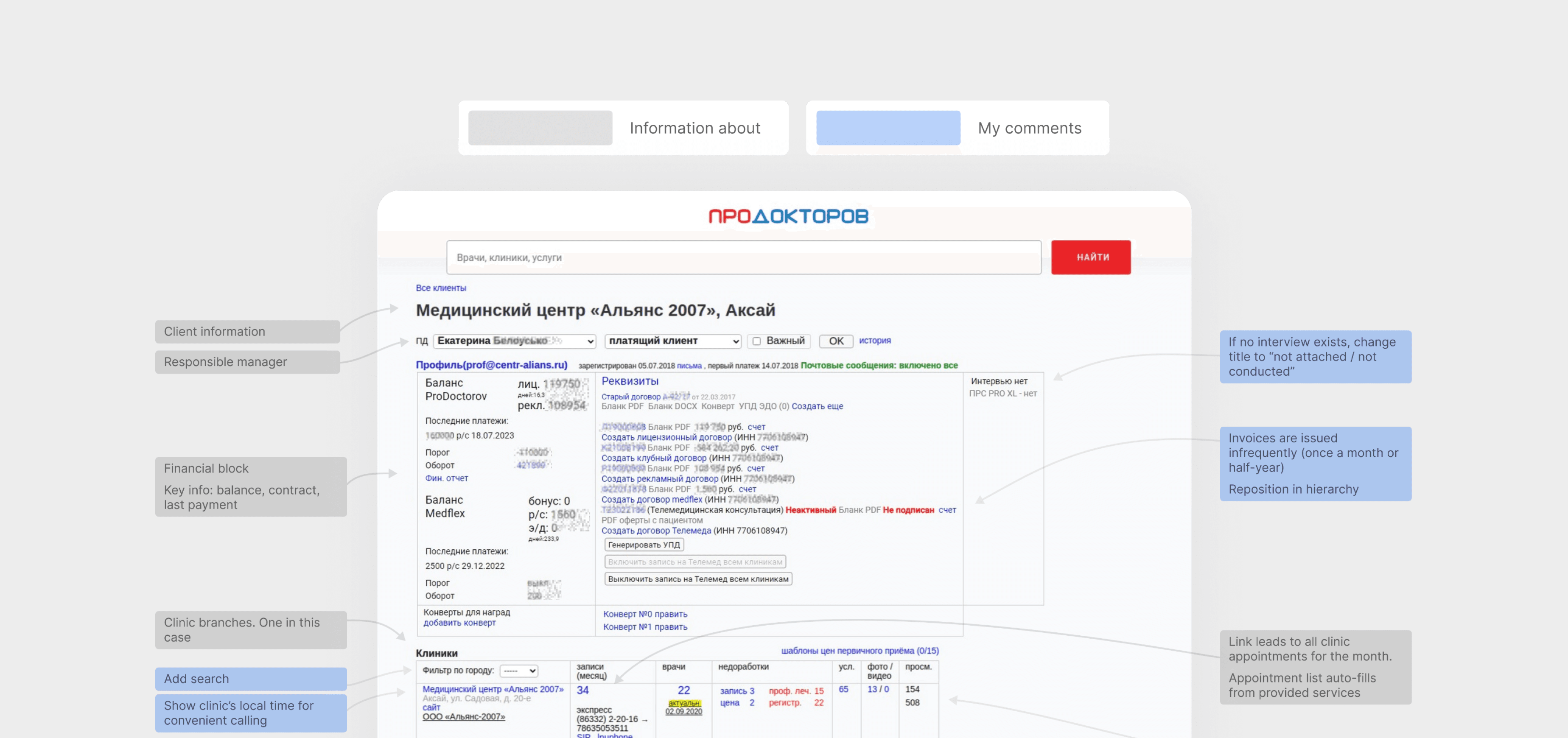
The existing interface was overloaded with information and poorly structured.
Managers struggled to find the right data, took too many steps to complete simple actions, and new employees needed up to 2 months to adapt.
Design Goals
Make navigation intuitive
Prioritize high-frequency actions
Reduce onboarding time for new employees
Increase visibility of financial metrics and client status
Key Design Decisions
Reorganized layout — moved high-usage sections (Contacts, Journal) above the fold.
Redesigned Finance block — introduced clear hierarchy and visual grouping.
Added search and tags — for quick navigation between clinic branches.
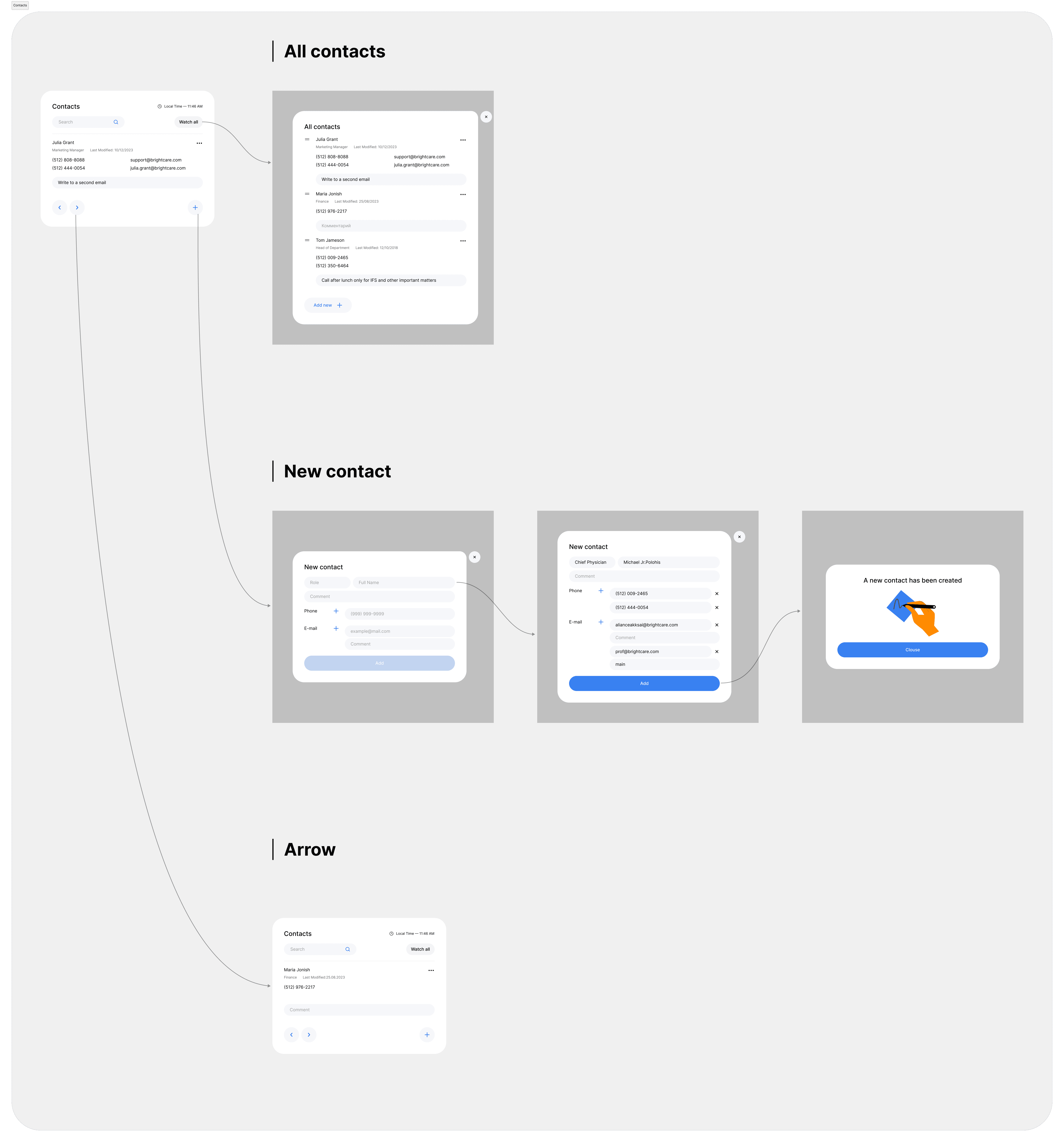
Grouped MIS + Contacts — enabling context-driven communication.
Timestamped updates — to prevent outdated client information.
Insights
Old Design page
Task Analysis
Each project begins with research: I dive into the product, business processes, and domain to create solutions grounded in real user needs.
Conduct interviews with managers about their work
UX audit and flow mapping
Identifying usability issues
Creating redesign concepts
Building an interactive prototype and UI kit
Interviews
As part of the research, I conducted interviews with two customer service managers who had been working in the company for 1 and 2 years.
New employees typically need around two months to adapt to the current interface — a sign of weak hierarchy and unclear navigation. By the time of the interviews, users understood the purpose of each section but noted major usability issues: excessive scrolling due to information overload, difficulty finding data, and lack of filtering and visual structure.
Managers perceive convenience for handling incoming requests as the main priority of the interface. However, the focus should be shifted toward sections that drive KPIs — promoting new company products.
Research & Insights
Through interviews and observation, I mapped the main workflow:
1. Promoting New Company Products
2. Consulting on incoming requests
Critical sections (Contacts, Journal, Finance) were buried too deep.
Data duplication and inconsistent formatting.
No filtering or search within large accounts.
Cognitive overload due to visual clutter.
Promoting New Company Products workflow

Learn about the new product

Go to the manager’s main screen

Find and open the client card

Read important information for promoting the new product

Call or message the client

Record the conversation result in the CRM system

Testing
Competitive Analysis
The redesign focused exclusively on improving the interface without altering core functionality.
Therefore, direct competitor benchmarking was not relevant. Instead, I reviewed best-in-class UX patterns from CRM systems across various industries and used them as visual and interaction references to enhance usability for MedLok’s internal team.
Hypothesis
Expected Impact
Metric Impacted
Priority
Add branch search functionality
Faster case handling for large networks
Average Handling Time
High
Move the Contacts and Activity Log sections higher
Improved task efficiency and KPI growth
Resolution Speed
High
Relocate the MIS module closer to contact information
More efficient consultations and upsell flow
Sales Conversion
Medium
Transform the Contacts section into a slider view
Fewer invalid calls and faster access to relevant data
Data Accuracy
Medium
Display the Finance block horizontally
Reduced navigation time and better visual clarity
Time-on-Task
Medium
Add department labels to the Activity Log
Reduced duplicate actions and better team visibility
Collaboration / CSAT
Low
Participants
Since access to MedLok support managers was not available for final testing, I recruited sales consultants who actively use CRM systems. Their workflows and customer interaction patterns closely mirrored the target user group.
First-Click Test
Goal - Assess interface usability for basic CRM actions: opening documents, adding contacts and actions, editing contact cards
Watch Results
Simulated CRM Testing Method
Goal - Identify interface pain points and improve user experience in real work scenarios.
Watch Results
Design
Before Testing

After Testing

User flows
Journal

Contacts
Contracts
